Service Detail
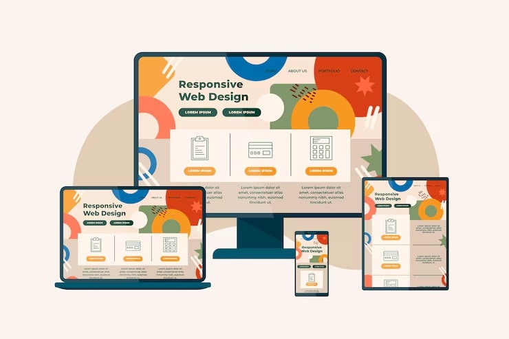
Responsive Website Design
Responsive website design ensures a website adapts to various devices and screen sizes, offering a consistent and optimized user experience while improving SEO and reducing maintenance costs.
Key Features:
Flexible Grids: Websites are built with grids that can dynamically adjust to different screen sizes, allowing content to rearrange and maintain readability.
Responsive Images: Images scale proportionally to fit the screen, preventing distortion or excessive scrolling.
Fluid Layouts: Elements resize appropriately, enabling the website to adapt to the user's screen size.
Adaptive Images: Images are sized using relative units to ensure they adapt to the available screen space without losing quality or creating layout issues.
Benefits:
Improved User Experience: Users have a consistent and optimal experience across all devices.
Enhanced SEO: Mobile-friendly websites are favored by search engines, leading to better rankings.
Cost-Effective: One website design can serve all devices, reducing development and maintenance costs.
Increased Reach: A wider audience can access the website, regardless of their device.
Easier Maintenance: A single codebase is easier to update and maintain than multiple designs.
Faster Loading Time: Optimized images and code contribute to faster loading speeds, improving user experience.
Competitive Advantage: A responsive website demonstrates a commitment to user experience and modern web practices.